BRAND GUIDE
Our Logo
To ensure a cohesive and professional representation of CCLB's brand, please adhere to the following guidelines. These principles are designed to help you maintain consistency across all platforms and communications, reinforcing our brand identity and values effectively.
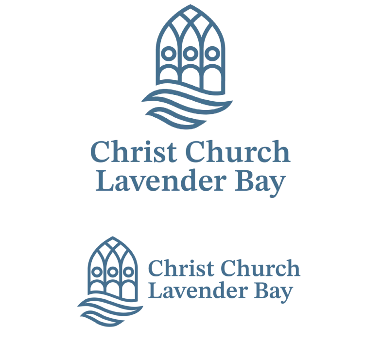
Logomark
When designing layouts, both horizontal and vertical orientations play crucial roles. A horizontal layout often enhances readability and creates a spacious feel, ideal for wide screens or print media. It allows elements to be easily aligned side by side, promoting seamless navigation. In contrast, a vertical layout naturally guides the viewer's eye from top to bottom, making it suitable for mobile devices or content-heavy pages. Each layout has its unique advantages, and choosing between them depends on the intended user experience and content presentation.
Logo Type
Christ Church
Lavender Bay
Lavender Bay
When designing layouts, both horizontal and vertical orientations play crucial roles. A horizontal layout often enhances readability and creates a spacious feel, ideal for wide screens or print media. It allows elements to be easily aligned side by side, promoting seamless navigation. In contrast, a vertical layout naturally guides the viewer's eye from top to bottom, making it suitable for mobile devices or content-heavy pages. Each layout has its unique advantages, and choosing between them depends on the intended user experience and content presentation.
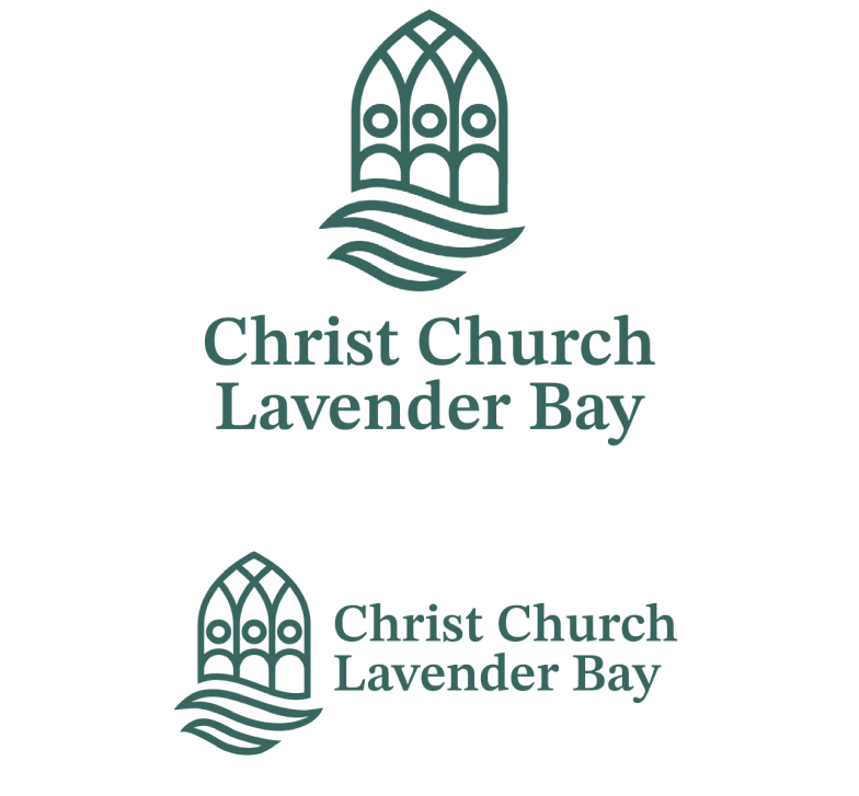
Main logo formats for a cohesive brand identity
When designing layouts, both horizontal and vertical orientations play crucial roles. A horizontal layout often enhances readability and creates a spacious feel, ideal for wide screens or print media. It allows elements to be easily aligned side by side, promoting seamless navigation. In contrast, a vertical layout naturally guides the viewer's eye from top to bottom, making it suitable for mobile devices or content-heavy pages. Each layout has its unique advantages, and choosing between them depends on the intended user experience and content presentation.
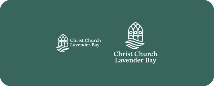
Using the logo on various backgrounds
The logo must be displayed clearly against all backgrounds. Ensure that the logo remains legible and visually appealing, regardless of the surface it is placed on.
Understanding the importance of clear space around the logo
To maintain the integrity of the CCLB logo, it is essential to define a clear space around it. This space prevents the logo from being overshadowed by other design elements, ensuring it stands out effectively.
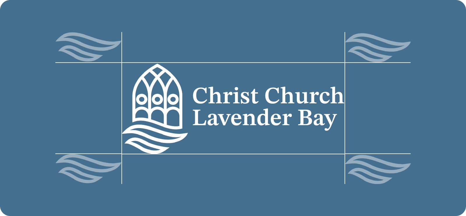
The spacing around the CCLB logo is equivalent to the width and height of the logo’s wave icon.
Understanding minimum logo size for clarity
To maintain the integrity and legibility of our logo, it is crucial to adhere to the specified minimum size. For print materials, the logo should not be smaller than 25 millimeters in width, while in digital formats, it should be at least 150 pixels wide. This ensures that our brand remains recognizable and professional across all platforms.
What not to do
Maintaining the integrity of our logo is crucial. Avoiding common mistakes ensures
our brand remains recognizable and professional.
our brand remains recognizable and professional.
Do not distort the logo
Do not add an outline on the logo
Do not add a shadow
Do not use different colors
Do not rotate the logo
Do not use another font on the logo
Downloads
Click the download button to download the logo set that you need.
Landscape
Set of logos in landscape layout versions. Useful for both light and dark backgrounds.
Portrait
Set of logos in portrait layout versions. Useful for both light and dark backgrounds.

Icons
Set of logo icons in blue, green, and white. Useful for both light and dark backgrounds.

White
Set of white versions of the logo in both portrait and landscape layouts useful for dark backgrounds.
Blue
Set of blue versions of the logos in both portrait and landscape layouts.

Green
Set of green versions of the logos in both portrait and landscape layouts.
BRAND GUIDE
Up Next
Continue discovering the other elements of our brand guide
by clicking on any of the boxes below.
by clicking on any of the boxes below.
Logo
Learn how to effectively use the CCLB logo to convey professionalism and clarity in different documents, graphic works, and other forms of communication.
Typography
Good typography in CCLB's content improves readability and visual appeal, creating clarity and enhancing the overall reading experience.
Colours
Discover how to utilize CCLB's color palette to elevate your designs and craft visually stunning projects with ease and effectiveness.


